February is among us, which means its time to look at the important things going on in the month before the actual month is planned in particular. I definitely have struggled with getting creative for this type of page, so when in doubt I turn to the MAMBI blog for inspiration. Sure enough, MAMBI Social Media Coordinator Amanda Zampelli has an adorable page filled out, and included a super cute pic of her boyfriend with some other embellishments. Drawing inspiration from that, I came up with this memory keeping type page, and I'm so in love and already thinking about March's layout.
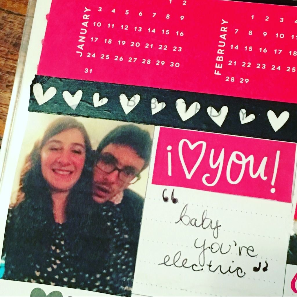
To size this pic down of my boyfriend and I (taken last Valentine's Day, actually), I measured the paritcular section I knew I wanted it to go in, and then put those dimensions into MS Word. I knew I didn't want it to take the whole width of the page, but more on the height side. I of course left wiggle room for embellishments. The black and white heart washi tape (last year Target Dollar Spot) was a nice and stark contrast against the bold red box above that contains the monthly overview calendars. I printed out some MAMBI printables from a previous V-Day on their website, and cut out this "I love you!" scrap from one of the pocket pages. I definitely played around with things like a jigsaw puzzle, seeing what fit where the best. Running scenarios over is part of the fun of it! After I finished the majority of the layout, that section was looking a little sparse still - I didn't like how there was a bit of a white box just chillin' out! I heard this song play from a commerical from the TV (I was doing this in a communal space) and heard "baby, you're electric" which went perfect for my lovey dovey/romance theme of this February layout.
For Special Events, I decided to highlight the fact that my first two articles will be submitted for publication this month in the magazine I intern for (see publications). I like to use my gold foil stickers sparingly, so I used the "big day" one for this special occasion.
For Feb Goals, my friends and I are in the midst of planning a trip to Orlando that month to go to Universal, so I put this adorable picture of my friends we'd be going with/seeing there as a visual reminder that this trip needs to get planned! The thin gold washi complemented the gold, red, and black theme I was going for.
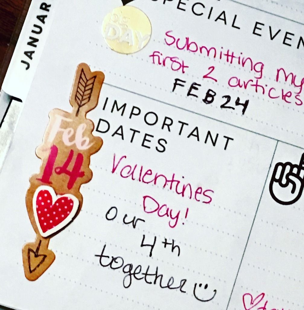
For Important Dates, I decided to put V-Day down since it would be my fourth with my BF. Plus, I had this super adorable chipboard sticker from Target Dollar Spot this year that already had the date on it and everything - it was meant to be!
Lastly, I had just about run out of ideas when I was reading some of the cute extra V-Day stickers I had (I bought a lot this year, but hey, they're only a buck!) and used this Don't Forget section as a reminder to myself since this year it has to do with my OLW: 2016 (One Little Word) which I will go more into depth with next month. "You Are Whaley Special" is a special little something just for me. I also put down "take polaroid pictures" because I want to get a bunch on my weekend getaway with my friends since. Scrapbooking is a personal goal of mine for 2016, and doing this layout made me realize how much I'm looking forward to taking the steps to make it happen.


No comments:
Post a Comment